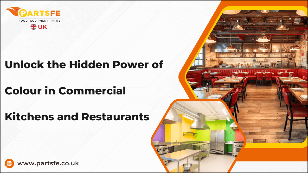
Unlock the Hidden Power of Colour in Commercial Kitchens and Restaurants
Colour within hospitality environments represents far more than decoration, it is a strategic design element that shapes customer behaviour, influences staff productivity, and reinforces brand identity. In the demanding world of commercial kitchens and restaurants, the psychology of colour extends beyond visual appeal. It impacts how customers feel, choose, and dine, and determines how efficiently kitchen teams perform under pressure.
Understanding how colour psychology operates allows restaurant owners, interior designers, and architects to create spaces that not only look appealing but also perform effectively. From warm hues that stimulate appetite to calming tones that promote focus and safety, every shade has purpose and meaning. This guide explores how colour functions as a psychological and operational tool in the hospitality industry, from customer perception to staff productivity and brand differentiation.
The Science Behind Colour Psychology in Hospitality
Colour psychology is grounded in human perception and emotional response. Decades of research demonstrate that colour has both physiological and psychological effects, subtly guiding behaviour and shaping mood.
-
When guests enter a restaurant, their first impression is visual—long before they read a menu or speak to a server. Colours send immediate signals to the brain: warm tones such as red and orange generate energy and excitement, while cool hues like blue and green evoke calm and relaxation.
-
Within hospitality design, this understanding becomes a powerful asset. A bright, energetic palette can encourage turnover in a café or quick-service restaurant, while subdued tones foster relaxation in fine dining settings.
Ultimately, colour psychology in hospitality is both a science and a craft, one that, when applied effectively, bridges aesthetics with measurable business outcomes.
Influence of Colour on Customer Appetite and Perception
Every colour conveys meaning and influences how guests experience a space. In restaurants, this extends to how hungry patrons feel and how positively they perceive the food and environment.
-
Warm tones—stimulating appetite: Red, orange, and yellow are proven appetite enhancers. They raise heart rates, stimulate conversation, and encourage quick decision-making. These tones are especially prevalent in fast-food chains such as McDonald’s and Burger King, where the goal is to create a sense of urgency and energy.
-
Cool and neutral tones—encouraging relaxation: Cool tones such as blue, green, or mint create an atmosphere of calm and sophistication. Fine dining venues and modern cafes often employ these shades to invite guests to linger, relax, and savour their meals.
-
The balance of tone and lighting: The impact of colour on perception is also shaped by lighting. For example, warm hues may appear inviting under natural daylight but overly harsh under fluorescent lighting. Similarly, pastel tones might seem washed out if not complemented with appropriate accent lighting.
Colour, when strategically employed, doesn’t just attract attention, it builds emotional resonance, strengthens brand recall, and determines how guests feel during their dining experience.
Colours that Enhance Staff Productivity in Commercial Kitchens
While dining areas focus on customer experience, commercial kitchens demand functional colour strategies that improve visibility, hygiene, and morale.
-
Light and neutral shades for clarity: White, light grey, and soft cream are the dominant choices in professional kitchens due to their ability to reflect light effectively. Enhanced illumination reduces shadows, improves accuracy in food preparation, and lowers the risk of accidents.
-
Colour zoning for safety: High-contrast colour zones are invaluable for delineating specific functions and safety areas. Bright yellow or orange markings may highlight walkways, hazardous zones, or equipment areas. Such visual cues support better workflow management, minimise collisions, and promote compliance with Health and Safety Executive (HSE) standards.
-
Psychological impact on staff morale: Kitchens are often high-stress environments where long hours and intense focus are the norm. Neutral or subtly warm shades can reduce visual fatigue and stress.
For essential commercial kitchen appliances like dishwashers, fryers, griddles and grills, ice machines, and ovens, the external colours are usually chosen for durability and practicality. However, the broader backdrop of the kitchen benefits from bright and neutral shades like pure white, light grey, or soft cream.
An orderly, well-lit, and visually coherent kitchen space fosters team cohesion, reduces errors, and increases overall job satisfaction.
Strategic Colour Choices for Different Restaurant Concepts
Selecting the right colour palette requires a deep understanding of the restaurant’s concept, target audience, and service style. The design must visually communicate the brand’s purpose and appeal to the intended clientele.
Cafes and bakeries
-
Cafes benefit from warm, comforting tones that encourage social interaction and relaxation.
-
Butterscotch, honey gold, and pastel pinks evoke warmth and familiarity, while muted greens or earthy tones connect with organic and artisan themes.
Fine dining restaurants
-
For fine dining, restraint and sophistication are paramount.
-
Slate grey, deep plum, navy, and antique gold convey exclusivity and formality. These shades work well with high-end materials such as marble, brass, and polished wood.
Quick-service and fast-food outlets
-
Here, vibrant, attention-grabbing colours dominate. Tomato red, bright yellow, and electric green communicate speed, energy, and approachability.
-
The intention is immediate visual impact, ideal for high-traffic environments and spontaneous dining decisions.
Bars and lounges
-
Bars and lounges thrive on atmospheric, moody palettes. Midnight blue, charcoal grey, emerald, and burgundy encourage relaxation and intimacy.
-
When paired with layered lighting, such as ambient glows and accent highlights, these colours help craft a space that feels luxurious and timeless.
By tailoring colour strategy to the concept, designers ensure that each environment aligns with brand values and customer expectations, fostering a consistent and memorable experience.
Find out How Kitchen Design Consultants Make Commercial Kitchens More Profitable and Powerful
Practical Tips for Restaurant Owners and Designers
While understanding theory is important, the practical application of colour design determines success in real-world hospitality environments.
|
Tip |
Description |
|
Test colours in real conditions |
|
|
Seek objective feedback |
|
|
Consider maintenance and durability |
|
|
Invest in quality finishes |
|
|
Prioritise function in back-of-house areas |
|
|
Synchronise with lighting design |
|
Explore our Ultimate Guide to Commercial Kitchen Layout: Do’s & Don’ts
Conclusion
A well-executed palette encourages diners to return, improves workflow efficiency, and ensures visual consistency across all aspects of a venue.
Restaurant owners and designers who harness the psychological power of colour can expect enhanced ambience, greater staff morale, and improved commercial outcomes. As competition intensifies within the UK’s dining landscape, colour remains one of the most effective yet underutilised assets available.
By integrating thoughtful colour psychology into every stage of design, from kitchen to dining room, hospitality professionals can create environments that are both functional and emotionally resonant. PartsFe UK offers a wide range of OEM and compatible parts for commercial kitchens, including dishwasher parts, fryer parts, griddle & grill parts, ice machine parts, oven parts, and plumbing parts. with fast UK-wide shipping and excellent customer support.
References:
https://www.ashford.gov.uk/environmental-concerns/food-safety/food-premises-advice-note/
FAQs
How can lighting complement the colour scheme in a restaurant?
Lighting enhances or alters the perception of colour; warm lighting intensifies reds and yellows (making spaces cosier), while cool lighting amplifies blues and whites for a modern feel.
Are there digital tools or software that help choose restaurant colour palettes?
Yes, tools like Coolors, Adobe Colour, and Colormind can help designers experiment with palettes suited for restaurant interiors and branding consistency.